When designing a brand new site, even if it’s just a layout change like what we originally planned, there’s always a question of whether or not ideas need to be carried over from the old to the new. Along with these come brand new ideas that everyone wants to implement on the site and shifts in thinking that only appear when people have enough knowledge and experience to modify or outright say whether something needs to go.
Because of our change in focus, with the central core being the crew and everything else revolving around it, a lot of the standards that we knew from building the old site would have to be altered, and new ideas would eventually replace the old.
The Foundation For Our New Ideas
If you’ve been following my Twitter or listened to older episodes of the podcast, you probably aren’t surprised to know that I’m a big supporter of Apple’s ideals. To clarify, I’m not so much of a fan of the company’s products as I am with what they believe in regard to how they conduct their business. Last month, the following video was released to start up this year’s WWDC. This video encapsulated both Apple’s corporate strategy and their approach to product development.
These few words bring up a lot of different philosophical discussions with not just design, but life in general. But while talking about philosophical ideas and direction is fine for creating a framework for new ideas, we needed to make sure that the ideas we came up with applied to Gamer Horizon and, to a larger degree, gaming sites as a whole in order to see what works. To use as an example, we decided to go back to one of the basic fundamental reasons why gamers visit a website: to find information relevant to them.
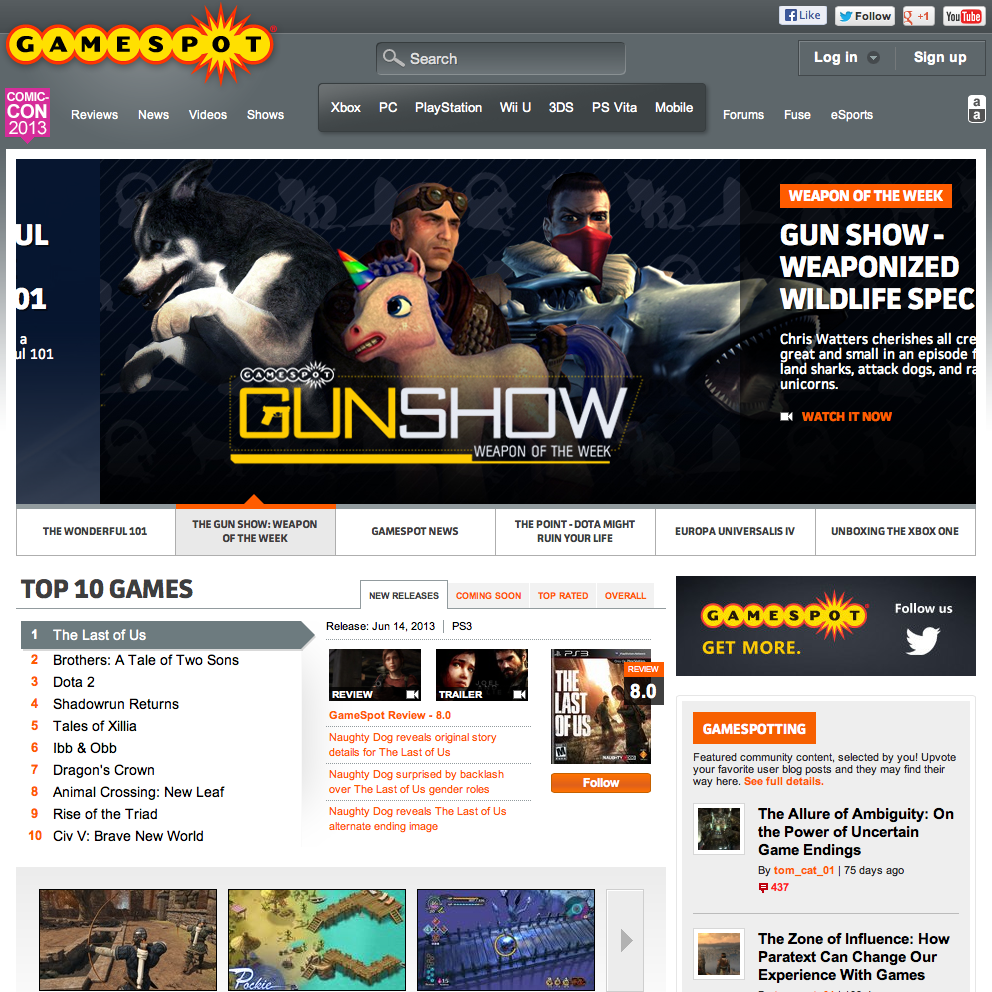
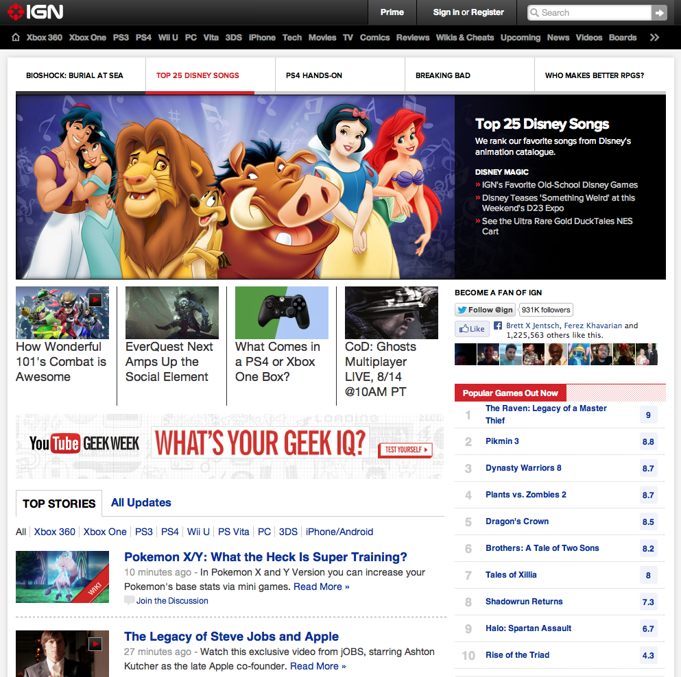
A lot of the gaming sites that have been around for a long time tend to provide a lot of choice when displaying their content. This is, of course, to show that they’re able to deliver new content in a timely fashion. While this is true to their vision of what they want to portray their sites, this begs the question: What feeling does the website really evoke for gamers who want to look for interesting content?
To answer this, I indirectly asked many gamers from different walks of life what they thought of these sites. Not surprisingly, all of them said that it was difficult to find information on these sites’ home pages because of how much information is being displayed. One of them even said, “Who were these people designing these sites for?”
We firmly believe that it’s because of this design aesthetic that drives a lot of gamers, including the crew here on our site, to aggregate everyone’s content on their RSS readers or discover new content via forum threads such as on NeoGAF. The idea is that when you’re given a lot of choice to digest content, it just becomes overwhelming and you want an alternative.
It wasn’t enough though that we confirmed with many people within our geographical location what they thought of these sites. We wanted to have this knowledge rooted from intensive studies. Fortunately, TED Talks has a wealth of knowledge in its database and one day, I actually found a video that featured Sheena Iyengar on the art of choosing.
The studies Sheena Iyengar presented were from various examples ranging from different age groups to different types of scenarios, all confirming one thing: When presented with too many choices, most people tend to either hesitate to make a decision or try to avoid it altogether. It’s then that we decided to design a homepage that is visually and aesthetically pleasing to the eye, but had information that was very easy to grasp.
The example we just outlined is but a few of the many things that went into consideration when going in and figuring out the new features that the new website will have. However, it wasn’t just the new ideas that would be affected by these fundamental changes in thinking. The old ideas needed to be brought to current standards with all the knowledge that we’ve learned.
The Old Is New Again
Redesigning a site, regardless of its size, takes a lot of consideration from all angles. One of the biggest challenges we faced when redesigning the site is how to reincorporate some of the elements of the old site with the new in such a way that it made sense and something that wouldn’t take too long to explain. One such challenge is the amount of links we had on the top of the page.
When we designed the old site, we were thinking of ways we can expand the site to different directions. We were thinking really big, so after the March launch of the previous design, we added the ability to add meta data to posts in order to tie it to a specific game, platform, publisher, and developer. What we weren’t thinking, however, is how much content would be displayed when readers looked at each item. A couple or so months later, links to specific publishers, games, and developers began to surface that only included one post.
This is when we asked one very important thing: What was the point of all this meta data? Do people not really know what system a game is coming out in? How important is knowing a publisher and developer to a gamer’s interest in a game? More importantly, despite the answers to these questions, did it make sense for us to break up our content this way?
The answer was a resounding, “No.” While we’ve been delivering a surprising amount of high quality content since our launch in January, further categorization of our content would serve only to highlight the lack of content we’re able to deliver on the site and take away from the incredibly rich articles that we’ve created. In short: We didn’t need to be a Wikipedia for games, and we certainly didn’t need something that would easily point out our shortcomings as a gaming site.

However, not all ideas from the old site needed to be tossed. When we decided to move away from meta data categorization, we then ensured that we re-tagged all our old posts and displayed the tags on the new site. Tags were a basic feature that is supported by our content management system, and we decided to keep it simple by providing non-contextualized data that described each post via tags. This ensured that we would be able to provide another avenue for readers to find content that’s relevant to them. One other reason why this worked better than meta data categorization is that it allowed us to work with just one field when inputting games, developers, publishers, and platforms, speeding up the process of preparing a post to go live. Unlike the previous categorization scheme, it would be natural to find a tag that only contains 1 post, as the rules of tagging are a lot more lenient than the norm.
The above example is only a few of the many old ideas we needed to reconfigure and rewrite for the new site. In the end, we wound up saving much of the information we entered in the background, and a lot of it would be presented in a meaningful way in the new site. With a whole list of revisions of old ideas and brand new ideas for the site, it was finally time to design what is to become the new Gamer Horizon website.
Photo courtesy of Crazy Love Studios

Nice article, as a graphic designer, I can relate on structuring website. The key point is to make it interesting, but at the same time make it easy access. Put too many things, it becomes messy and people get confuse, but if it’s too simple, it can lead to be uninteresting and people will hardly visit. Appealing, easy to navigate, and organization is the key to make a website worth visiting, especially to common consumers, for fans, not so much.
As for the Gamer Horizon new website, I’m still evaluating, but I can tell it’s better than the old one, to some extent, it’s easily to look for news that was in June since, it generate older posts when I scroll down, instead of clicking to a new page, which is not bad, but it tend to have problems (connection problem).
Anyway, I would say just keep improving it, because there’s always room for it, and lastly, is there a suggestion box.
LikeLike
We’re working on getting some of the key features of the site up, and being able to give us suggestions is one of them!. There’s actually another feature that we’re working on right now that’s part of this that I’m still writing that talks about the design of the site. Hope you’re looking forward to it!
LikeLike
I will…
LikeLike